


Bio Link Growth hack
Maximise the impact of your social outreach with our Bio page templates
Read More
Exit popups are an incredibly popular marketing tool and that’s for one simple reason. They are very effective.
But exit popups get a lot of hate 🙀
Learn to create the type of exit popups that don't suck. The ones that add value and increase conversions, at the same time.
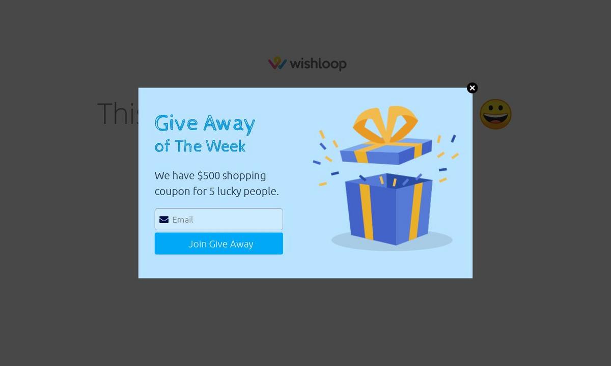
Get templatesDid you know…
😭 2 of every 3 visitors to your site leaves without taking any action…
Which means you’re currently losing a huge chunk of your potential revenue.
Love them or loathe them, exit-intent popups are one of the simplest ways to deal with this costly problem. (And we hope to convince you that there's way more to love than loathe).
A well designed exit popup can turn abandoning website visitors into leads or customers and add value to your website visitor's user experience at the same time. These are not mutually exclusive!
Its also one of the easiest optimisations you can make to improve your website.
Read on, to discover how to use exit intent popups effectively in .
What is an “interactive exit-intent popup”?
STEP 1 - Decide on your “re-engagement angle”
STEP 3 - Choose where you want your popup to show
STEP 4 - Integrate your autoresponder
STEP 5 - Put your campaign live!
STEP 6 - Optimize your campaign for higher conversions with split testing
As you might suspect, this method involves showing your website visitors a popup if they display “exit intent”...
(...i.e., if they move their mouse cursor to the ‘close’ button on their browser.)
You can use this method to prevent visitors from leaving your website, by re-engaging them at the critical “moment-of-truth”...
...giving them an extra reason to stick around & take action.
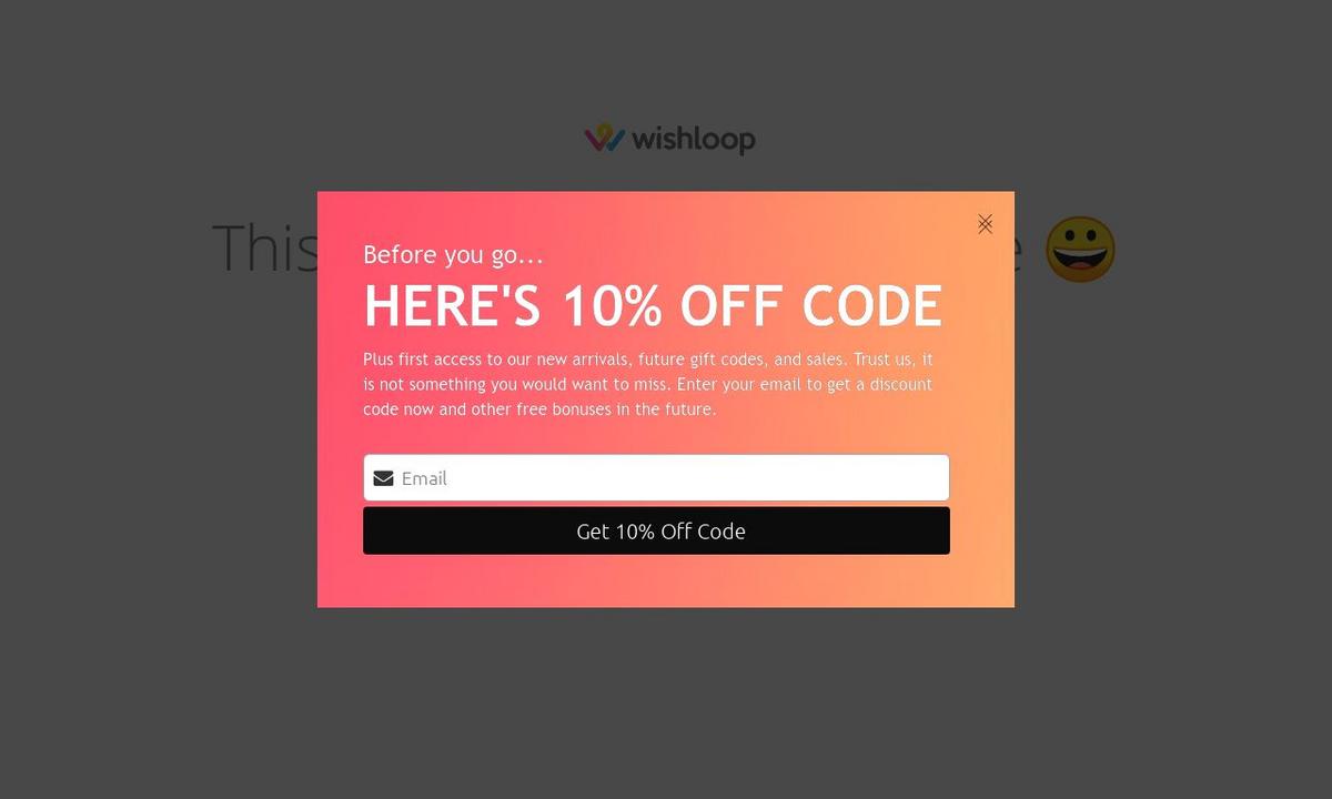
Here's a simple, but effective example:
Adding an exit-intent popup to your website is one of the fastest and easiest ways to reduce your abandonment rate & boosting your conversions.
And in case you think it wasn't worthwhile, here's a very sobering stat:
E-Commerce brands lose $18 Billion in sales revenue each year because of cart abandonment
Forrester researchBut its not just for e-commerce businesses.
Any business owner or marketer who’s looking to convert more online visitors into leads or customers can benefit from adding an exit-intent popup to key pages on their website and sales funnels.
So whether you’re a:
...it doesn't matter.
If you're interested in maximizing profits and have any kind of presence online, then a well deployed exit popup could make a positive, and significant, impact on your business.
Just remember...
The Website Abandonment Rate across all industries is 69.57%
Baymard Institute, updated September 2019in other words, there's plenty room for improvement. And, as you'll see next, plenty of ways an exit popup can help.
Let’s face it, exit pop-ups have a bad reputation.
But we think this is unfair - a hangover from their inglorious past.
Sure, they used to be ugly, spammy & annoying...

But things have changed...
Nowadays it’s possible to create beautiful, interactive exit-intent popups that boost your conversions AND enhance the browsing experience for your visitors.
In fact, they’re actually one of the most effective ways to optimize your website for more conversions.
This is because exit-intent popups create a “pattern interrupt” which FORCES abandoning visitors to rethink their decision to leave your site…
...giving you a free second shot at converting them.

Remember, the purpose of your exit-intent popup is to get your abandoning visitors to:
Therefore, to achieve this, you need to create a popup that:
The key here is having an effective and relevant “re-engagement angle” - i.e., a good reason for a disengaged, abandoning visitor to stick around.
This is fundamental to the success of your popup...
You can have the most beautiful design in the world; but if your re-engagement angle’s a dud, your visitors will ignore it and continue to move on.
To reiterate: if a visitor is leaving your website, you need to give them a good reason to change their minds.
The most important part is to work out exactly what offer you'd like your exit popup to present.
And its fair to say, this is also the most difficult part. The part that stops many people in their tracks before they even get started.
But fear not! We've got you covered...
Here are 7 of the most widely used angles and incentives (and lots of templates for inspiration), which you can use to re-engage and capture your abandoning visitors:
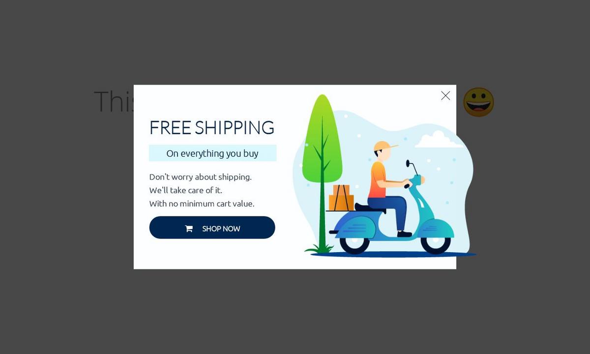
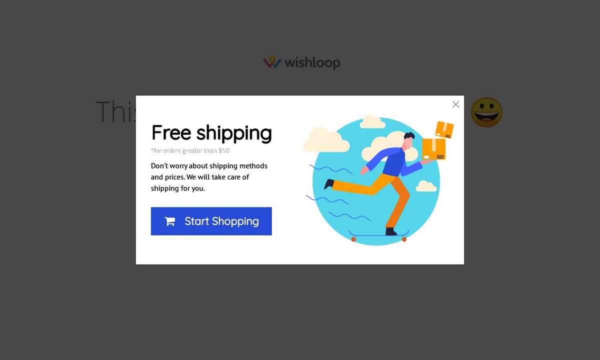
If you run an ecommerce store, one of the most frequent reasons for checkout abandonment is unexpected or elevated shipping expenses.
This nasty surprise gives potential buyers a reason to rethink their purchase - leading to a dropoff in the checkout process.
An exit-intent popup can help you to tackle this issue by offering free shipping or a discount for the first purchase.

The offer tackles your abandoning visitors’ reasons for quitting head-on, so a significant proportion will take you up on the opportunity...
Another reason people abandon a purchase is the last-minute nerves around parting with more money than they can afford. This is particularly true of higher-ticket products.
To help resolve this, you could provide split-pay or credit payment options in your exit-intent popup.
Similarly, you could offer an alternative place to purchase the item from, such as in-store, or from a more familiar website (like Russell Brunson does here…)

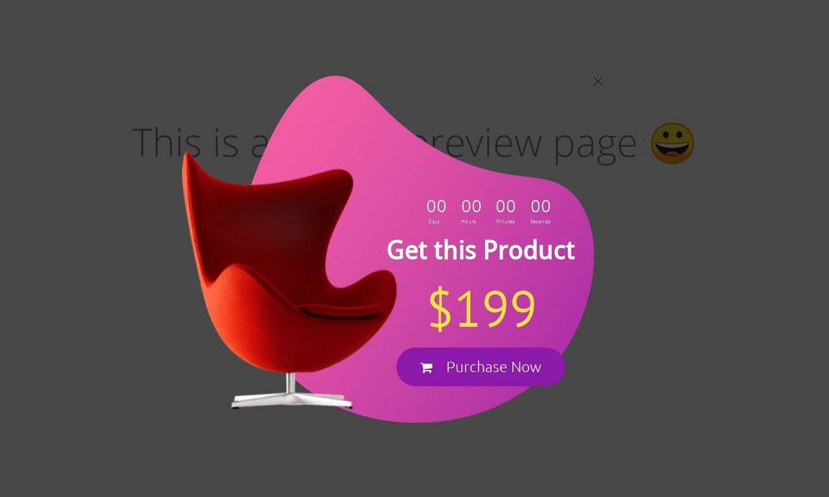
You can also use an exit-intent popup to remind abandoning visitors of what they’re missing out on - by reiterating the main benefits of your product.
This is especially powerful when combined with scarcity or urgency because they’ll know they can’t come back to claim these benefits at a later time.
Similarly, you could use the popup to answer common objections. For instance, if a common objection from potential buyers is, “I won’t get enough use from it,” you could list several instances in which your product would come in handy.
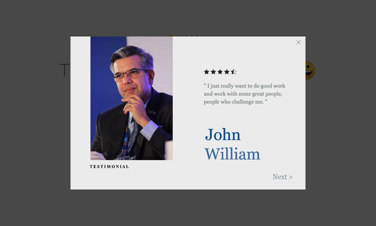
Social proof is a powerful persuasion tool.
Knowing that like-minded individuals are doing something that we aren't, is often enough to make us want to join in.

You could deploy your best customer testimonial videos and case studies in exit-popups to show abandoning visitors that they could enjoy the same benefits...if they stick around.
Here's a couple of testimonial popup templates to get you started.
Another common reason people abandon a purchase is having unanswered questions.
A lot of people also like to have some kind of personal interaction with a business, before pulling the trigger on a purchase, in order to know there is a face behind the brand and they’ll be supported long-term.
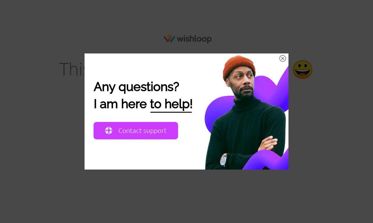
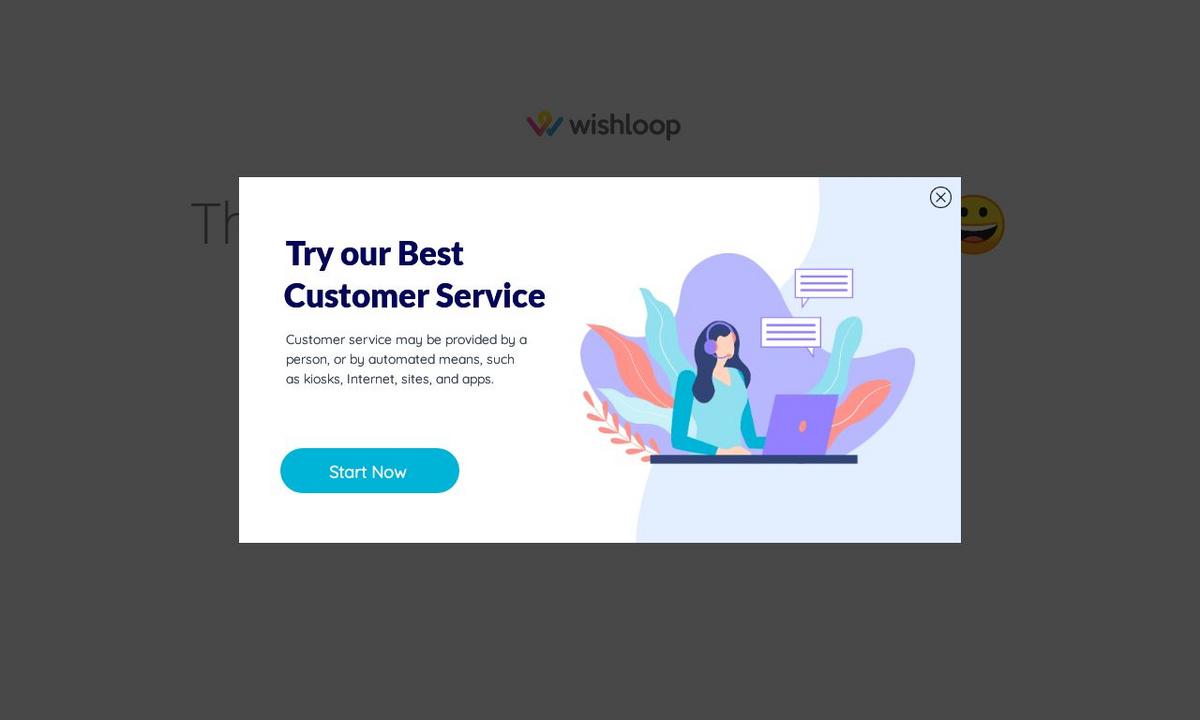
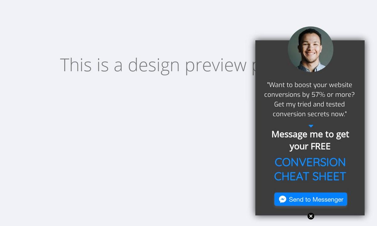
You can address these issues by proactively offering customer support in your exit popup.
For higher-ticket products, you can use this opportunity to invite prospects to book a 1-to-1 call, where you can provide an in-depth product demo and close the sale.
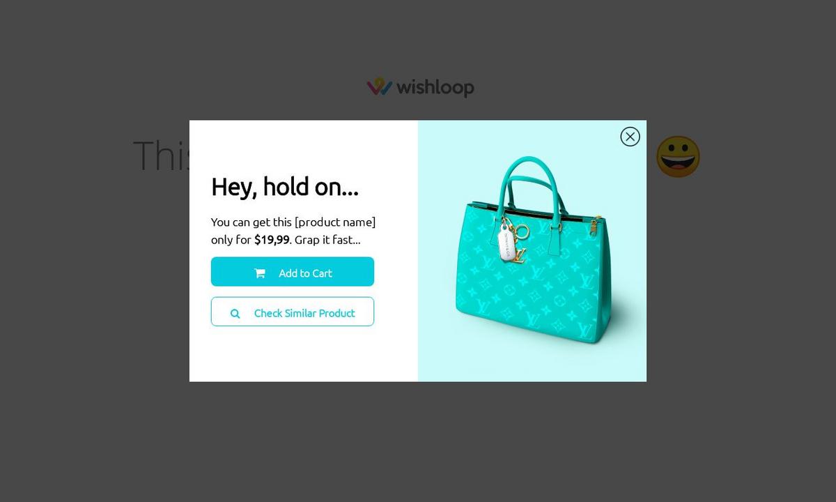
If you have multiple products, you can also use exit-intent popups to redirect abandoning visitors to alternative relevant products. The alternative product should address common reasons for abandonment.
So, for example, if people leave because the product is too expensive for them, you could send them to a down-sell which is more cheaply priced. Similarly, you could show visitors a range of alternative options within the same product range, to aid product discovery...
As well as using exit-intent popups to directly boost sales conversions, you can use them to convert abandoning visitors into leads (email or Messenger).
A good way to do this is via a contest - preferably with a prize that is related to the product on the page!
Here's a couple of examples:


And here's a couple of contest templates to get you started:
You can then follow up with everyone who enters the contest and convert them into paying customers at a later date...
🔥 HOT TIP 🔥
When you announce the winner of your contest, also send everyone who took part a small unannounced bonus - e.g. a 10% off voucher.
This is a simple way to overdeliver (Everyone's a winner!), and if you add a timeframe to the discount, then you can easily email your contest entrants a couple of times before the offer ends to remind them to make use of their voucher code.
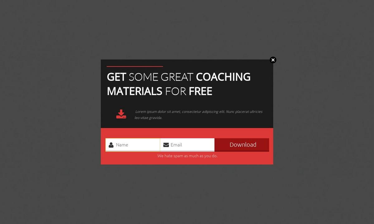
If you don't fancy running a contest, then you could offer a lead magnet to capture leads - such as an e-book, checklist, video course, or newsletter.
These kind of offers are incredibly popular.


Again, anyone who opts-in for the lead magnet could be entered into an email sequence to convert them into a customer...
Simple and effective.
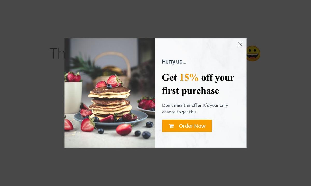
Small discounts work fine for this, 10-15% is perfect. Its just enough to catch the interest of someone who likes what you're offering but isn't quite willing to commit.
That's what your follow-up sequence is for 😊 so grab their email in exchange for a little discount.
Once you’ve decided upon your angle, the next step is to create your popup...
Here are the things to bear in mind when creating your exit-intent popup campaign...
First, choose a design style for your popup.
To hit the ground running, we’ve created a selection of ready-to-use templates. Simply choose a template that matches your angle, and hit the“Import” button to get started. You can then customize your design with the TD Pages drag-and-drop builder.
If you have a specific design in mind already, or a distinct brand style, you can design your popup from scratch in the TD Pages drag-and-drop builder (just select the “Blank Canvas” from the template gallery to get started).
🔥 TIPS:
These are critical to your success - because your audience will notice your images before they digest your copy. So your images need to give the best possible first impression.
🔥 TIPS:
Note: If you have a really strong headline and CTA, you may not need to add images (as they could distract from your copy). If you feel this is the case, you could split-test a version “with image” vs. a version “without image” to confirm (see Optimizing Your Campaign below)
The heading is the first text that your visitors see. As such it’s one of the most important drivers of conversions. Be sure to use a heading that clearly states the biggest benefit that your product/offer confers; tell your visitors exactly what they can get if they take action.
Use your (optional) sub-heading to further explain your offer and share the Unique Value Proposition.
Your headline + sub-headline needs to...
🔥 TIPS:
Here are a few useful and effective headline formulas you can use when creating your headline…
Direct headline (Works well for product pages):
“WAIT! [OFFER: e.g., Get Free Shipping/ 10% Off your first order]”
Unique Value Prop:
“The Only [Product Type] Made Exclusively to [Highly Desirable Outcome or Benefit]”
Social Proof headline (best paired with testimonials):
“Who Else Wants [blank]?”; “Don’t leave yet! Join our 34,098-strong tribe of [profession name]”
Command headline:
“Download Your Free [blank] Now”; “Grab This Free [blank] Now”
All gain, no pain:
“Get the [Rarely Seen But Relevant Adjective] Power of [What Your Product Does] Without [Pain]”
The How-to:
“How to Get [Desired Benefit] in under [Time Period]”
YES/ NO (best with a multistep campaign):
“Would you like [Desired Benefit]?
Curiosity Headline:
“Discover The 3 Weird Ways I Get [Benefit]”
Once you have your headlines in place, add additional copy to expand on your offer, break-down the benefits, and answer any common objections...
🔥 TIPS:
Even if it’s not your main angle, adding testimonials or case studies to your campaign is a proven way to increase conversions.
🔥 TIPS:
Adding urgency or scarcity to your offer is another proven way to boost your conversions. When we know something may soon be unavailable, our natural survival instincts kick in, and we feel the need to secure it for our future needs...
🔥 TIPS:
Last but not least, your offer needs a strong call-to-action.
No matter what you’d like to accomplish with advertising and marketing, you won’t do it without a compelling CTA.
Direct command CTA:
“Download Now”; “Subscribe” “Join”
Benefit focussed:
“[Benefit] Now” e.g. “Save 10% OFF Your Order Now”
1st person CTA:
“Send My Free [Blank]”
Instant gratification:
“Get Instant Access”
Almost all of your campaigns and content should have a well-crafted call to action designed to drive action.
🔥 TIPS:
Once you’ve created your popup, the next step is to connect it to your website.
Save your design. You’ll then enter the Settings Wizard to finalise the details...


Any popup that is collecting emails needs to be connected to an email autoresponder.
This will allow you to automatically follow up with your leads to convert them into customers.
Typically this only needs to be done once when setting up your account.

The final step is putting your campaign live on your website.
If your website is based on WordPress, then this is simply a case of installing our WordPress plugin and entering your TD Pages user ID and Worskpace API key into the plugin settings.
If you use any other platform, then you simply need to copy the TD Pages embed code and paste it somewhere before the </body> in your website's source code and you're done.
In any event, you'll find both of these options via Workspace Settings > Installation, within your TD Pages account.
💡
(this will boost your results but is not essential…)
There are multiple elements on your popup that can help you increase your conversion rate.
But ultimately, there are 7 key elements that will make the biggest impact on your results.
These are:
There are multiple different ways you could set up your split tests.
Many people will tell you to split test only 1 element at a time and keep all the other elements identical.
This is good advice if your site gets thousands of visitors and you're looking to squeeze out the last few fractions of a percent from your conversion rate.
For most people however, this is bad advice 😱
For your average exit popup for the majority of websites, you're much better off testing widely differing variations of each campaign.
E.g. testing radically different designs or completely different copy.
The goal is to optimise and iterate quickly, spotting and reacting to general trends in your campaign data (as opposed to finding a small statistically significant uplift from any single change made to your campaign, as is the goal of traditional A/B split testing)
As an example, here's a basic campaign testing workflow:
🧪 Phase 1 - Create 3 variations of the same exit popup. Keep the messaging identical or similar but with radically different designs - e.g. one colourful version, one with a background image, one with a very plain style.
The aim is to get a few hundred impressions on each variation to see if any early trends emerge. e.g. is one campaign outperforming the rest? Is one clearly not performing? If it's too early to say, then give it another week then check again.
🧪 Phase 2 - Duplicate the best performing 1 or 2 campaigns from phase 1 and tweak the messaging, the headline, the CTA, remove the bullet points, etc...
Aim to create anywhere from 2-6 new variations here, to help dial in the campaign messaging. Again, keeping a close eye on the results over the next few weeks will help you react to the incoming campaign data. Weed out poor performers and divert more traffic to the best ones.
🧪 Phase 3 - The best 1 or 2 performers from phase 2 now become the control. From here on out you're only trying to beat the control and the pace of testing typically slows a bit.
On an aged campaign, you should aim to always be running 1 or 2 new variations against the control, but typically the traffic split will be 70% on the control and 30% on the new variations.
Of course, you could test the copy first in week 1 and then design in week 2. Or if your site doesn't get much traffic, you may want to run each test for several weeks.
The exact mechanics of what's being tested and when and for how long are not the most important thing here.
The most important thing is adopting a mindset where you're continually making small adjustments to test new ideas and improve your marketing campaigns, whether its an exit popup, or a landing page, or even your email follow up sequence.
The data never lies.
#alwaysbetesting!
Exit-intent popups are a great tool for sending the last message to your visitors before losing them, potentially forever.
They’re also one of the easiest ways to boost your bottom line - enabling you to turn your abandoning website visitors into leads and customers with one simple tweak.
So what are you waiting for?
Import one of the ready-to-use templates above - and start converting more visitors today 😀
Maximise the impact of your social outreach with our Bio page templates
Read MoreBuild your list and make commissions by promoting our FREE Live Training each week.
Read MoreHow to get new customers through the door every month on autopilot… using the Facebook “Birthday Method”
Read MoreCreate your first squeeze page in just a few clicks and start building your email list today with our ready-to-use templates!
Read More
Discover the 3-step Perfect Offer Formula.
Taking the guesswork out of creating a winning offer... in under 30 minutes.
Read More7 tips & templates to turbocharge your Black Friday & Cyber Monday promotions
Read MoreHow to get free traffic & leads from every link you share – with the “Content Infiltration” growth hack
Read MoreHow to add value on every offer you promote with our done-for-you bonuses
Read More


